This year, we return to the essence of NARUMI—craftsmanship guided by a keen awareness of quality, and a quiet devotion to the smallest details.
Refinement, for us, is not a statement. It is a commitment—beginning at the first sketch and carried through every stage, until our standards are expressed with integrity.
From that deepened foundation, we move outward—expressing what NARUMI stands for in a language that feels right for today. New forms, new designs, and new experiences—shaped by purpose, and made with intent.
Refine & Resonate is not change for its own sake. It is a deepening—so our craftsmanship resonates where standards are highest: in the hands of chefs, in the rhythm of service, and in the moments guests remember.
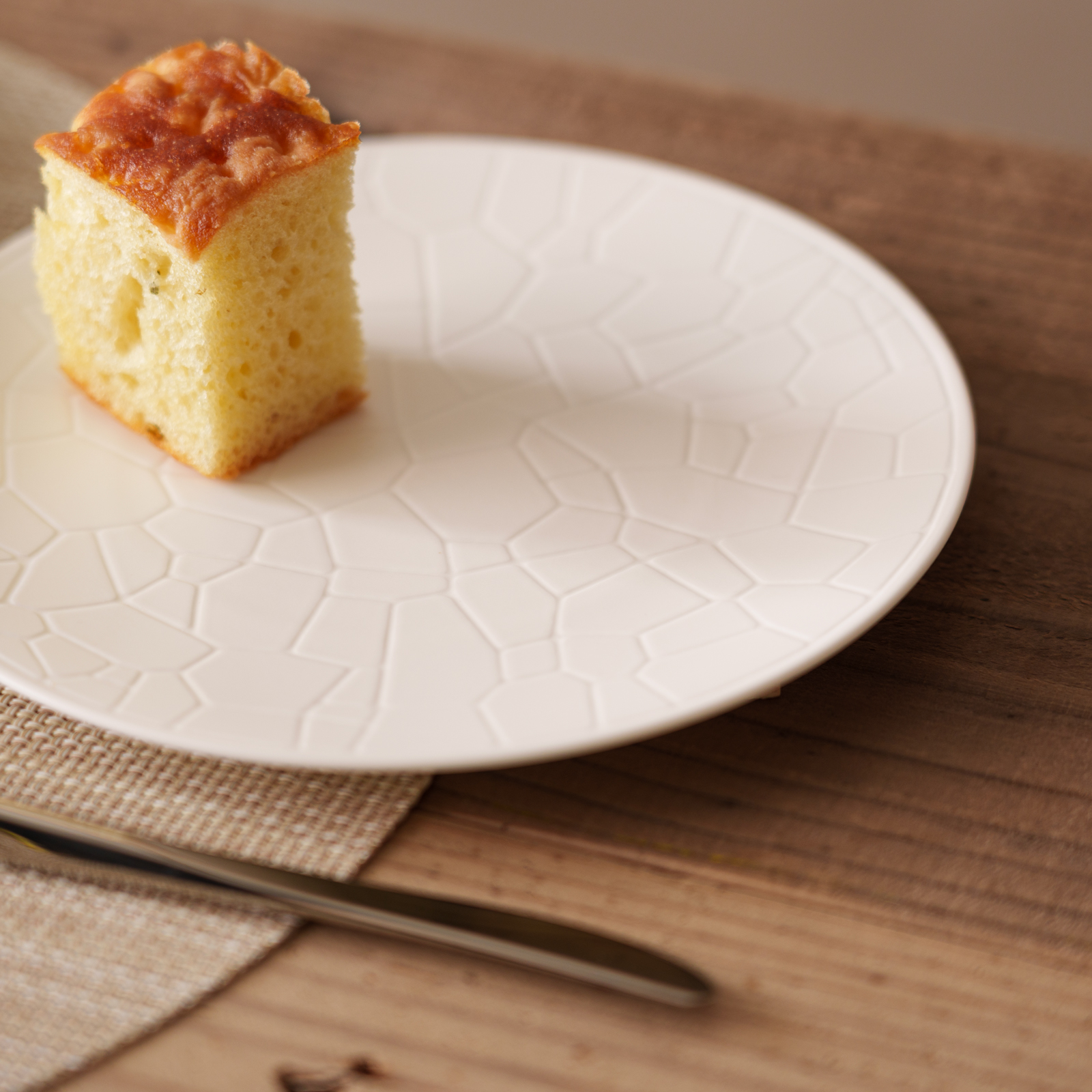
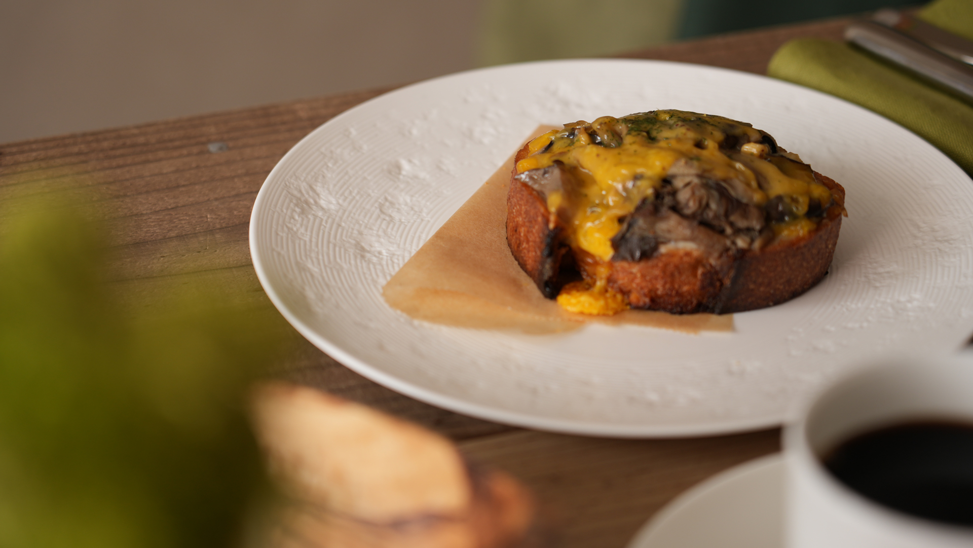
Resonance Relief Designs
This series reimagines the simplicity of the new coupe shape with a distinctive relief texture. Matte and transparent glazes enhance the surface, adding layers of depth and a rich, dynamic expression.
Inspired by Japanese aesthetics, the design is rooted in three key concepts:
Natural Beauty: The artistry of capturing nature’s essence.
The Passage of Time: Finding beauty in imperfections and the elegance of aging.
Harmony in Contrasts: The interplay of opposing elements to create balance.
Blending tradition and modernity, this signature series offers a refined canvas for creative dining presentations.
Relief variations
・Fade
Inspired by Japanese aesthetics, the design is rooted in three key concepts: The Passage of Time: Finding beauty in imperfections and the elegance of aging.
・Solid
Natural Beauty: The artistry of capturing nature’s essence.
・Random
Harmony in Contrasts: The interplay of opposing elements to create balance.
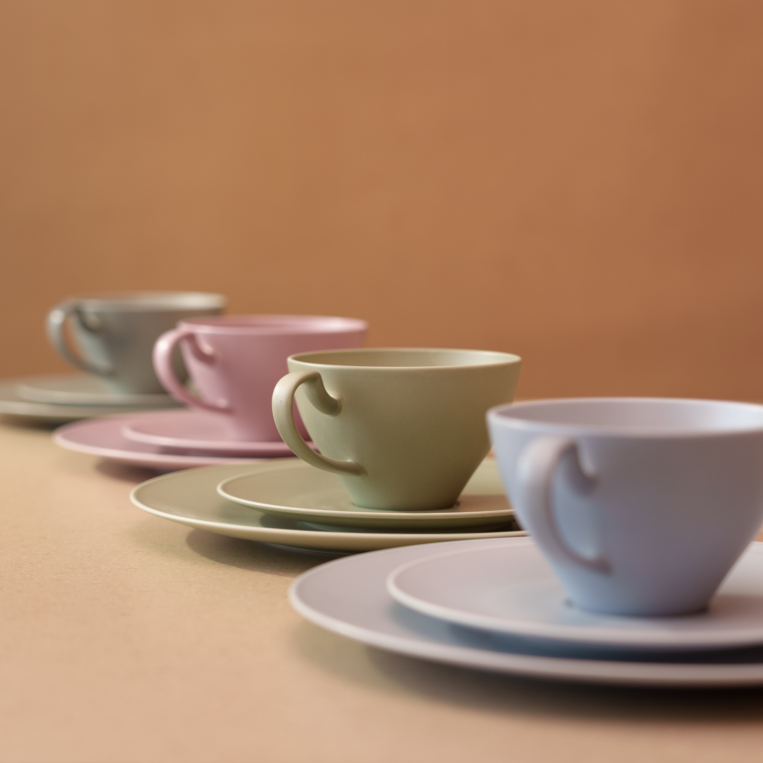
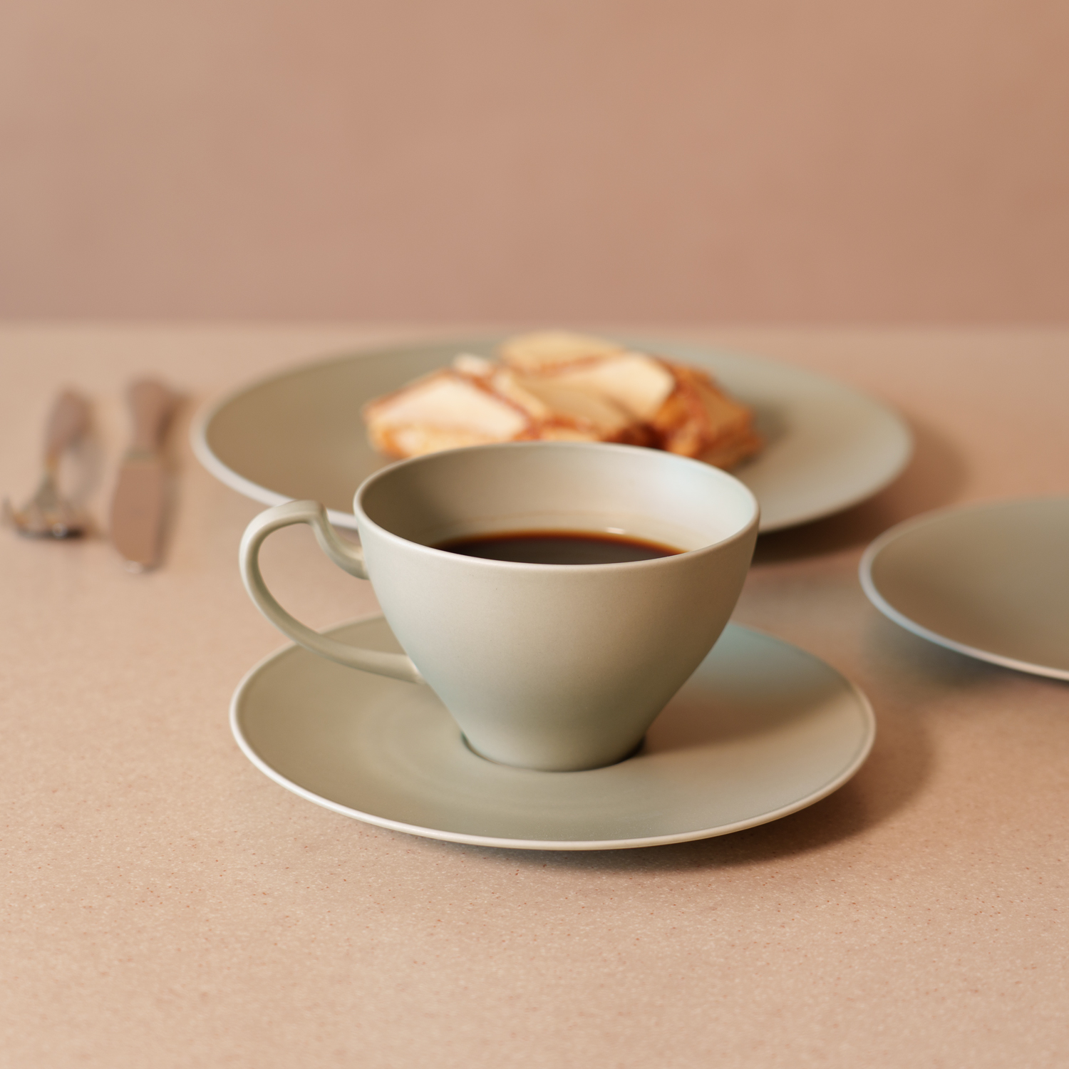
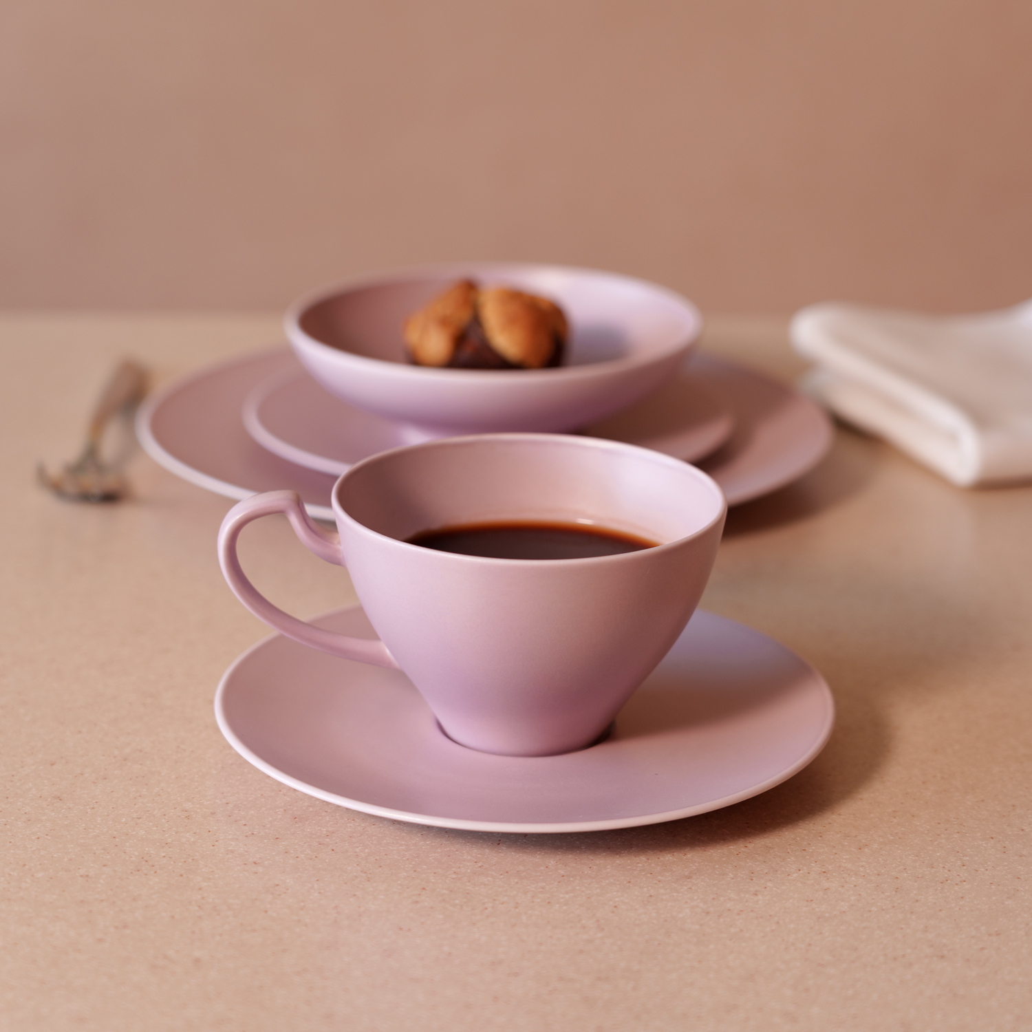
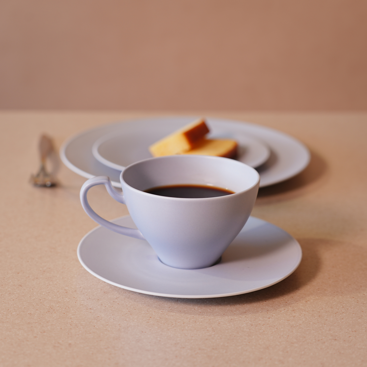
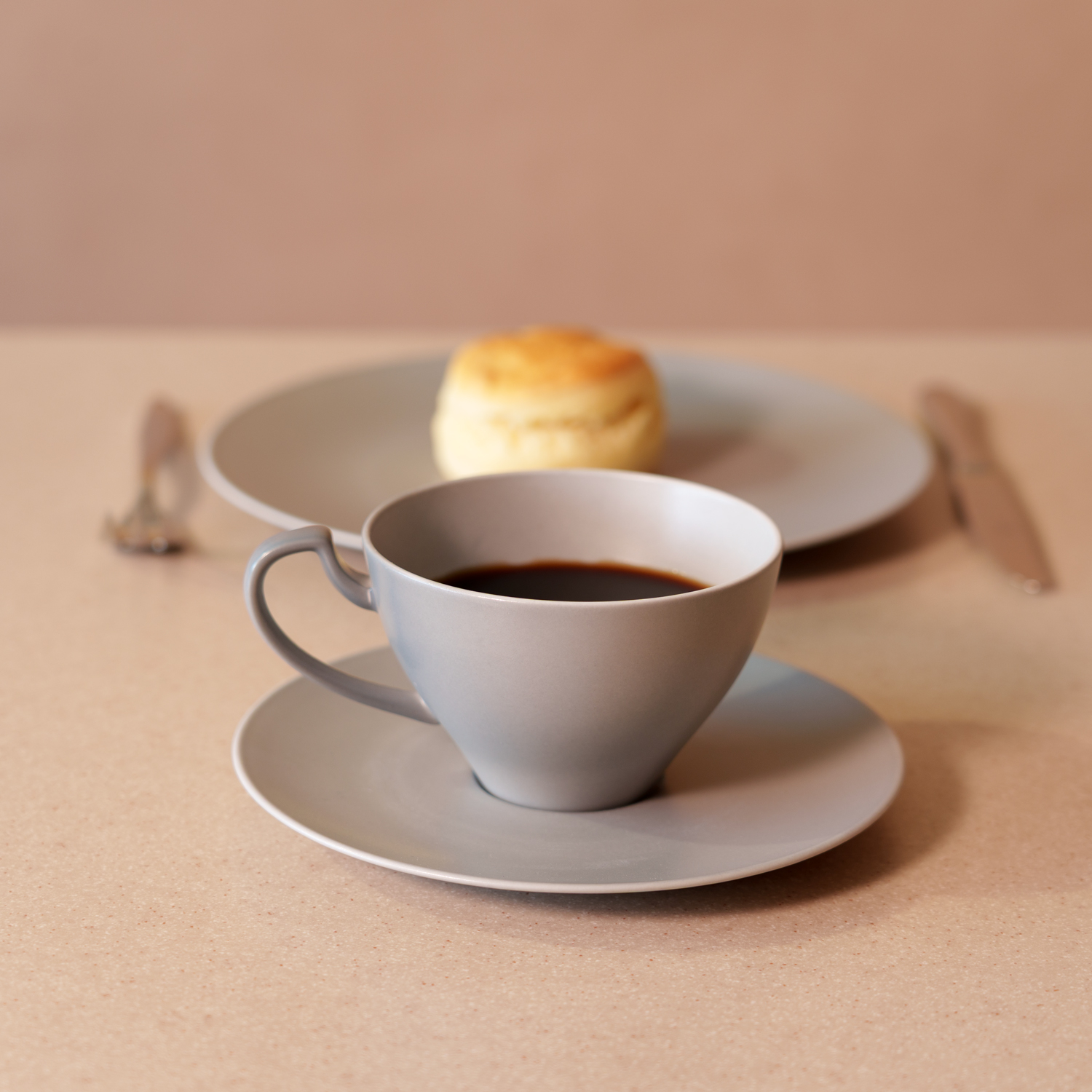
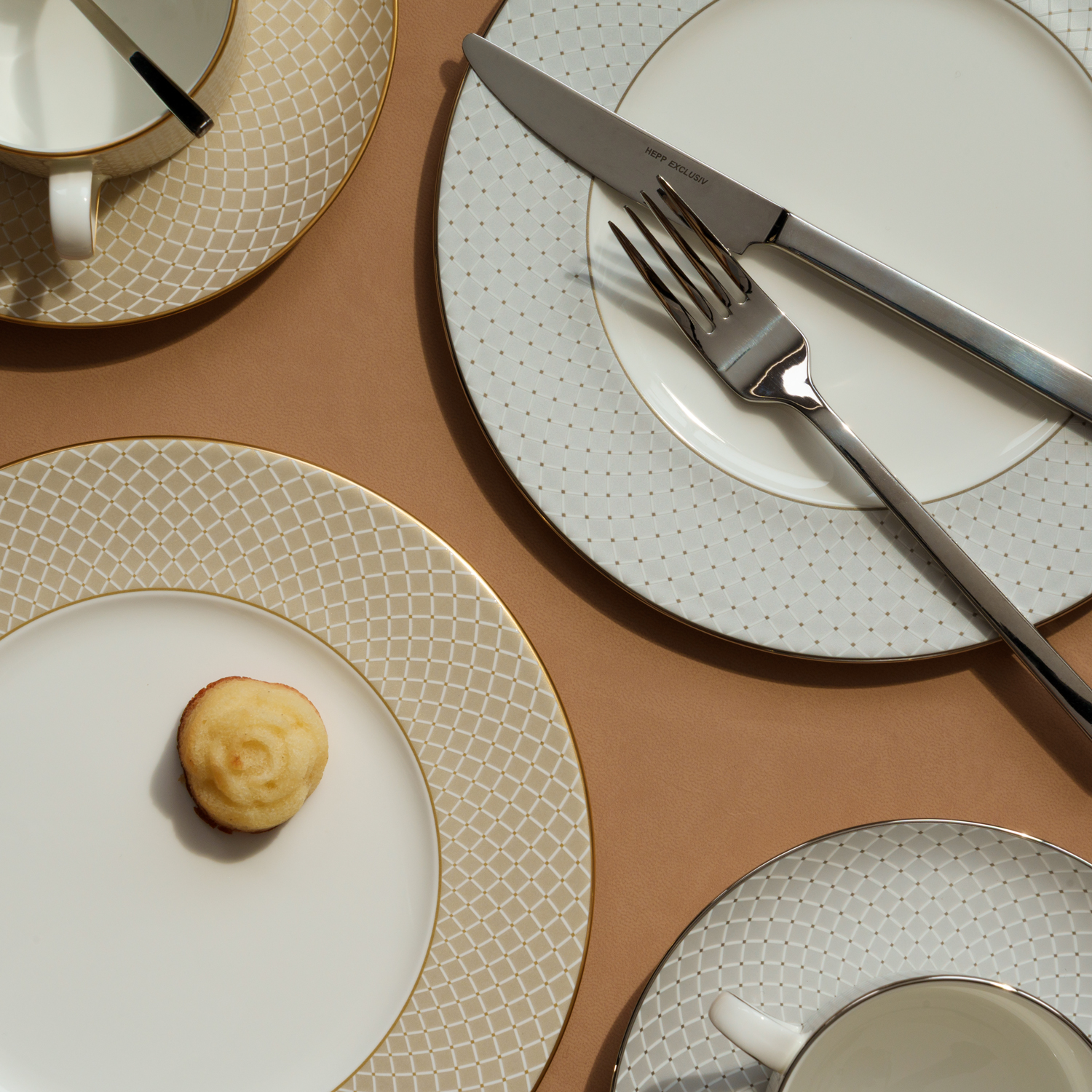
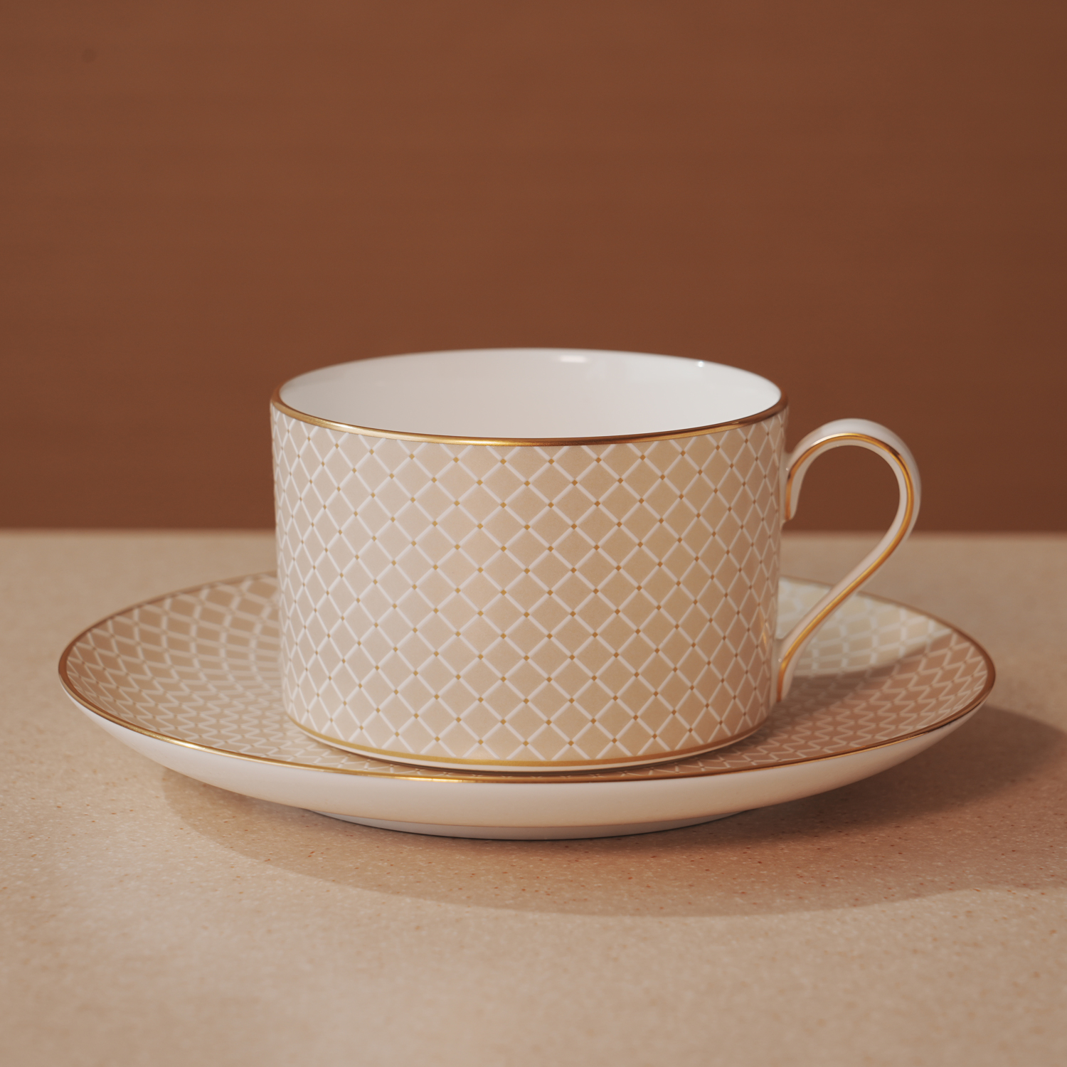
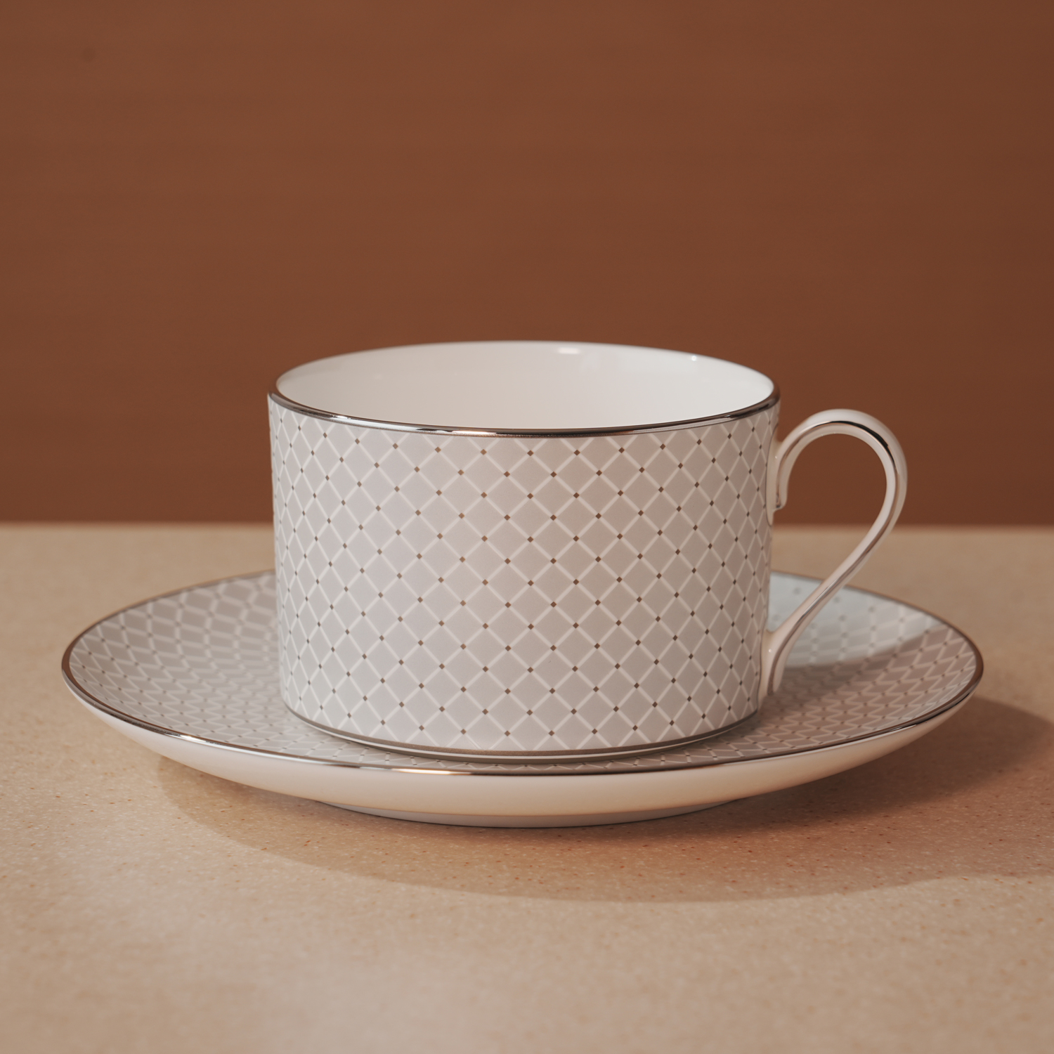
Resonance Silky Matte Glaze Colors
Defined by clean, linear forms, the modern and stylish Resonance collection is now expanded with the Color Glaze Series, featuring refined colored glazes.
The color-glazed finish combines a matte texture with a subtle, silk-like sheen. Each tone is inspired by the changing seasons and sensibilities of Japan, offering a balanced and sophisticated palette.
Designed to enhance presentation while offering flexibility for seasonal menus and styling, the series adapts seamlessly to a variety of service needs.
Suitable for hotels and restaurants, as well as cafés and bakeries, this versatile collection delivers consistent performance across a wide range of dining environments.
Colour variations
・FOLIAGE
・BLOOM
・DRIZZLE
・VEIL
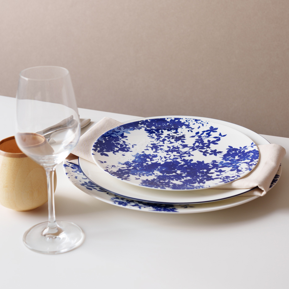
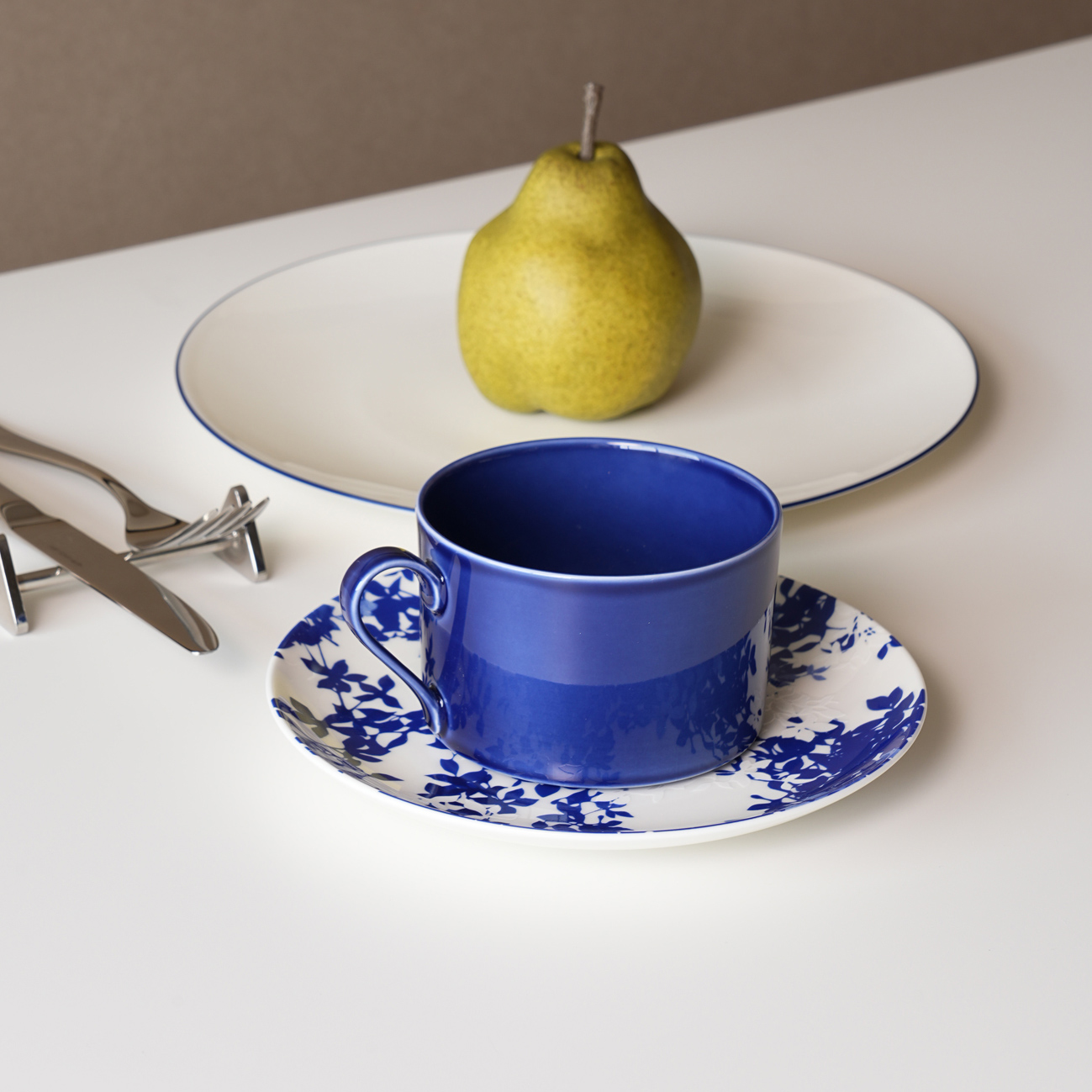
Serenity
White and blue, with a quiet, steady presence.
Serenity is inspired by traditional East Asian ceramics once used as art objects and furnishings, carrying forward an older sense of beauty with a modern design touch.
The deep blue tones of classic blue-and-white ware bring a feeling of stillness, while the contrast between white and blue creates a gentle visual rhythm. Floral motifs are rendered in a contemporary style, allowing the past and the present to exist side by side.
The design recalls familiar, unchanging moments — leaf shadows against the sky, light filtering through branches, and leaves moving softly in the wind — creating a calm, balanced atmosphere at the table.
Nova
Geometry that moves across time. Patterns used across different eras and cultures are refined with delicate, contemporary detailing—creating a design that feels familiar, yet shines with a new brilliance.
A radiant gloss, reminiscent of stars in a clear night sky, and sculptural curves that rise with an open, flowing rhythm leave a lasting impression and naturally draw the eye.
While enhancing the presence of each dish, the design brings a brighter elegance to the table—adding light, polish, and a more refined atmosphere to the space around it.
Colour variations
・Gold
・Platinum
Ripple
This series captures the quiet, mesmerizing moment of ripples forming from a single drop of water.
The gold version reflects the shifting shimmer of water under the sun, while the white version uses a white-on-white texture to convey a sense of purity and stillness. Designed to highlight the contrast between texture and light, Ripple brings a refined, organic elegance to the table.
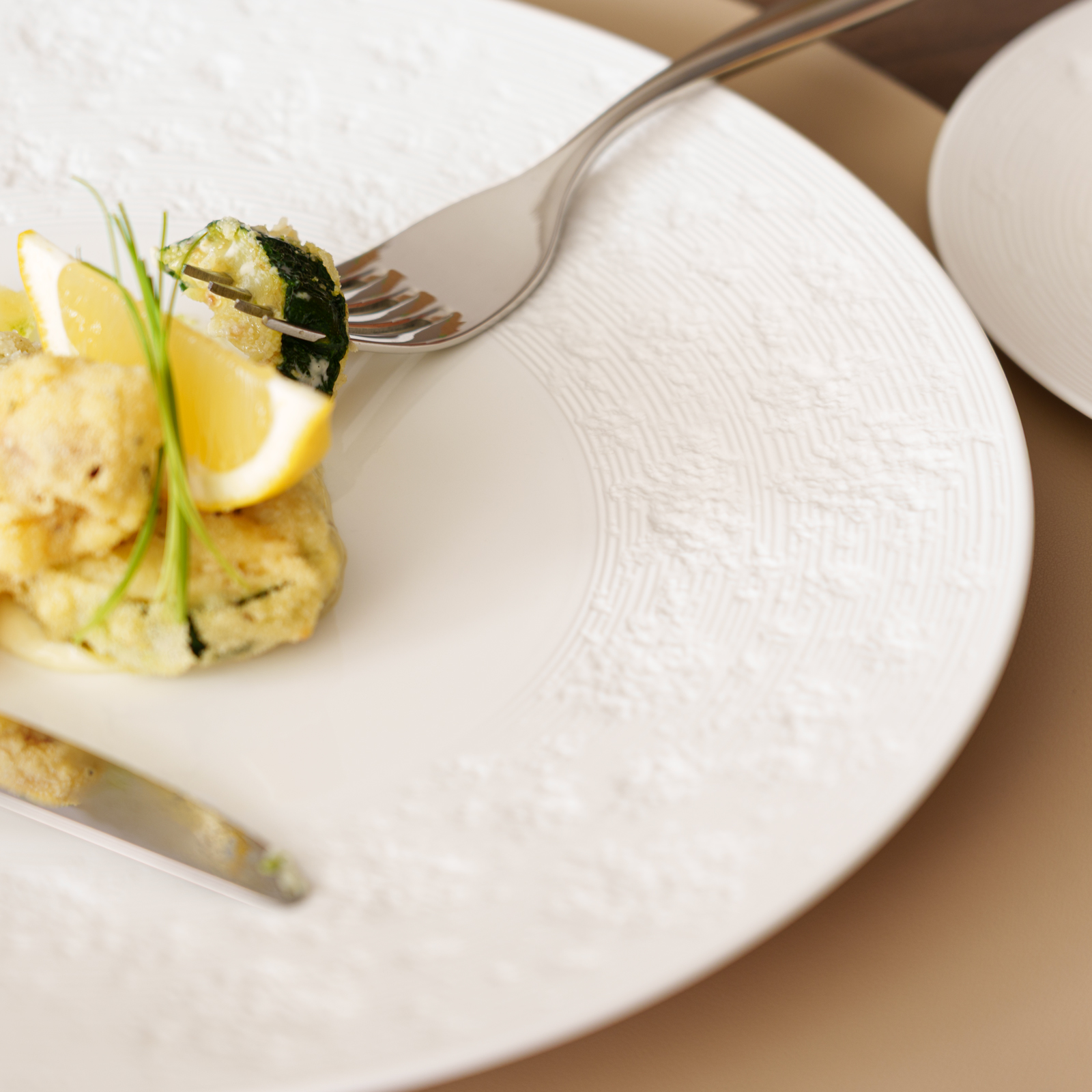
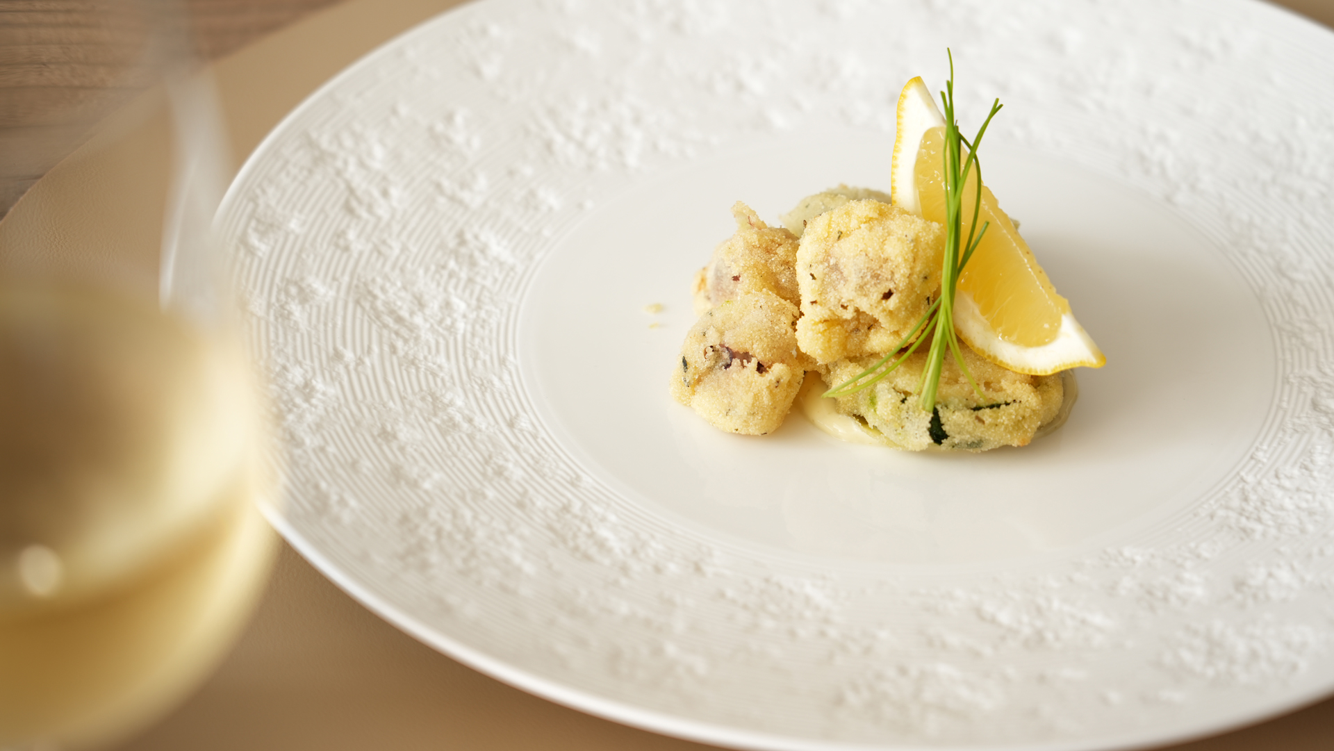
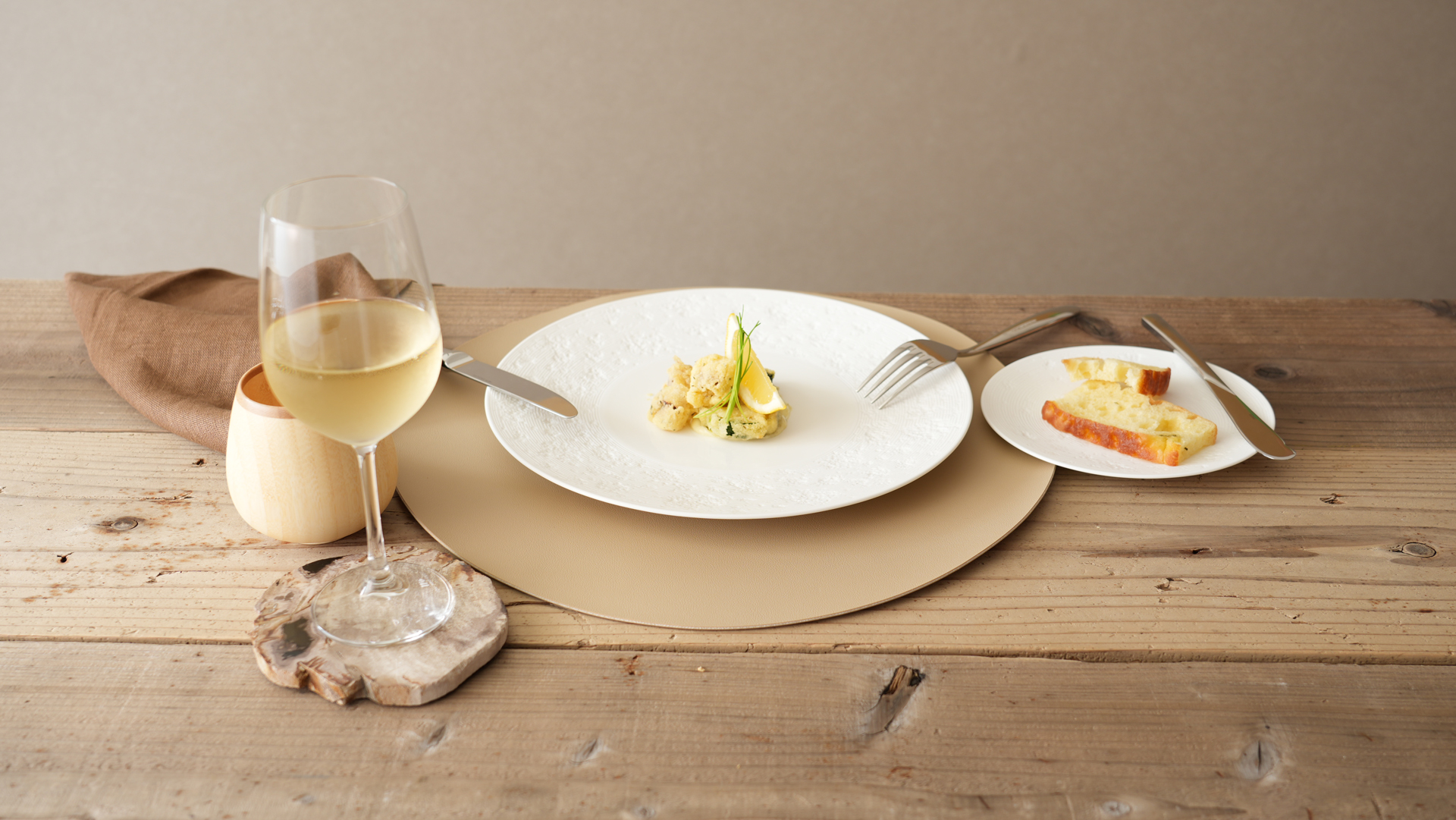
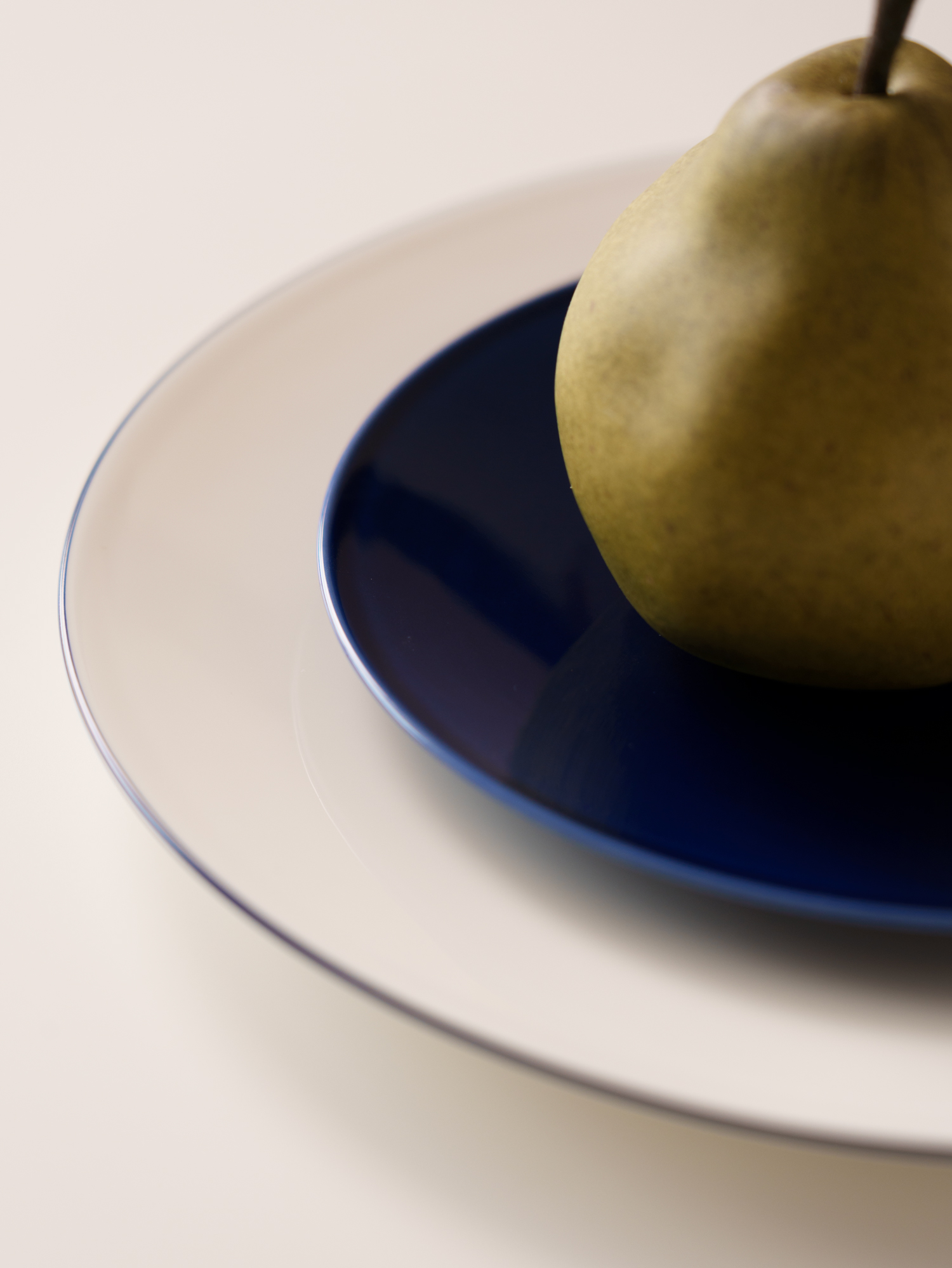
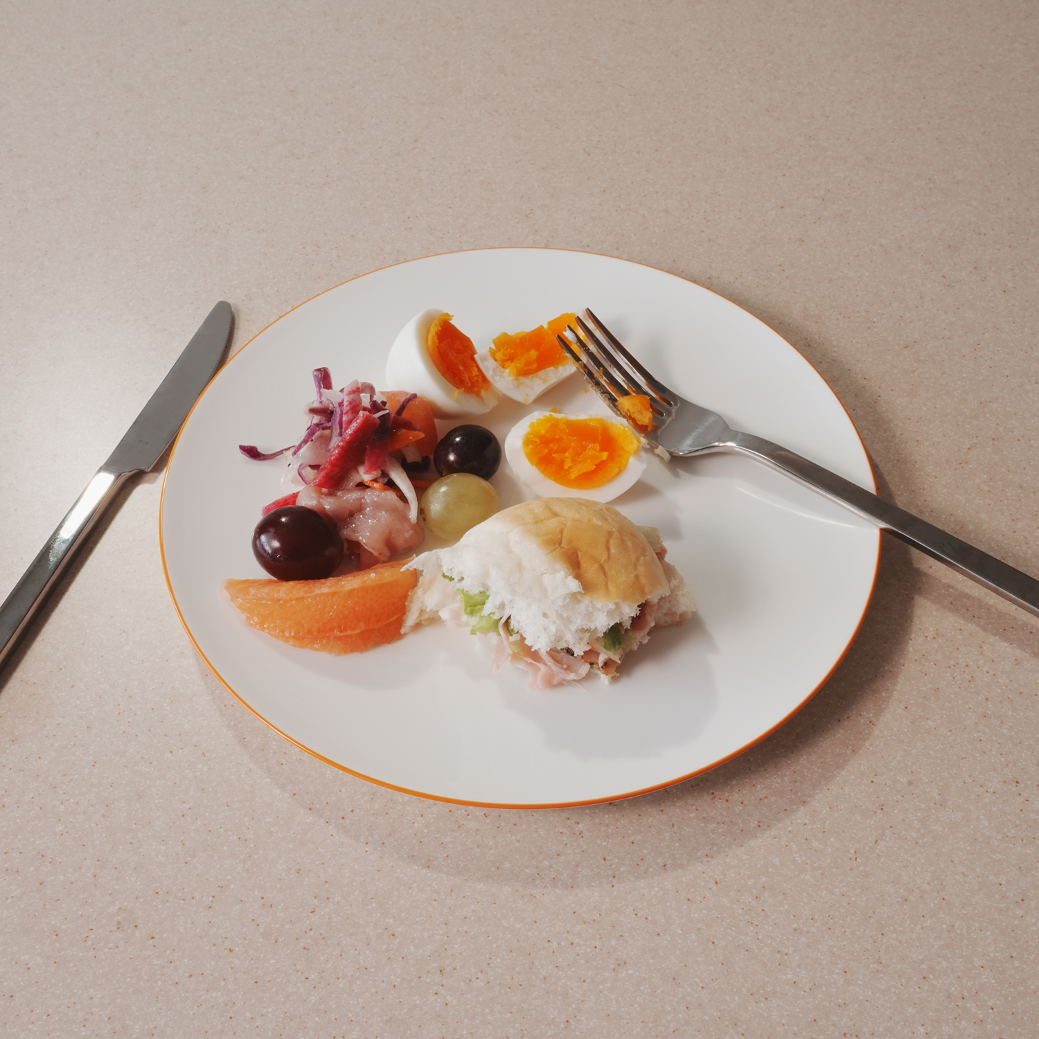
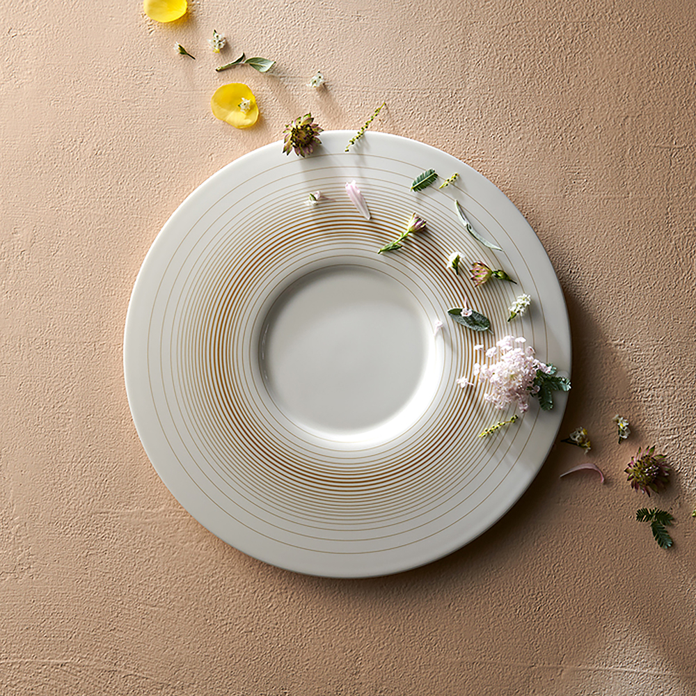
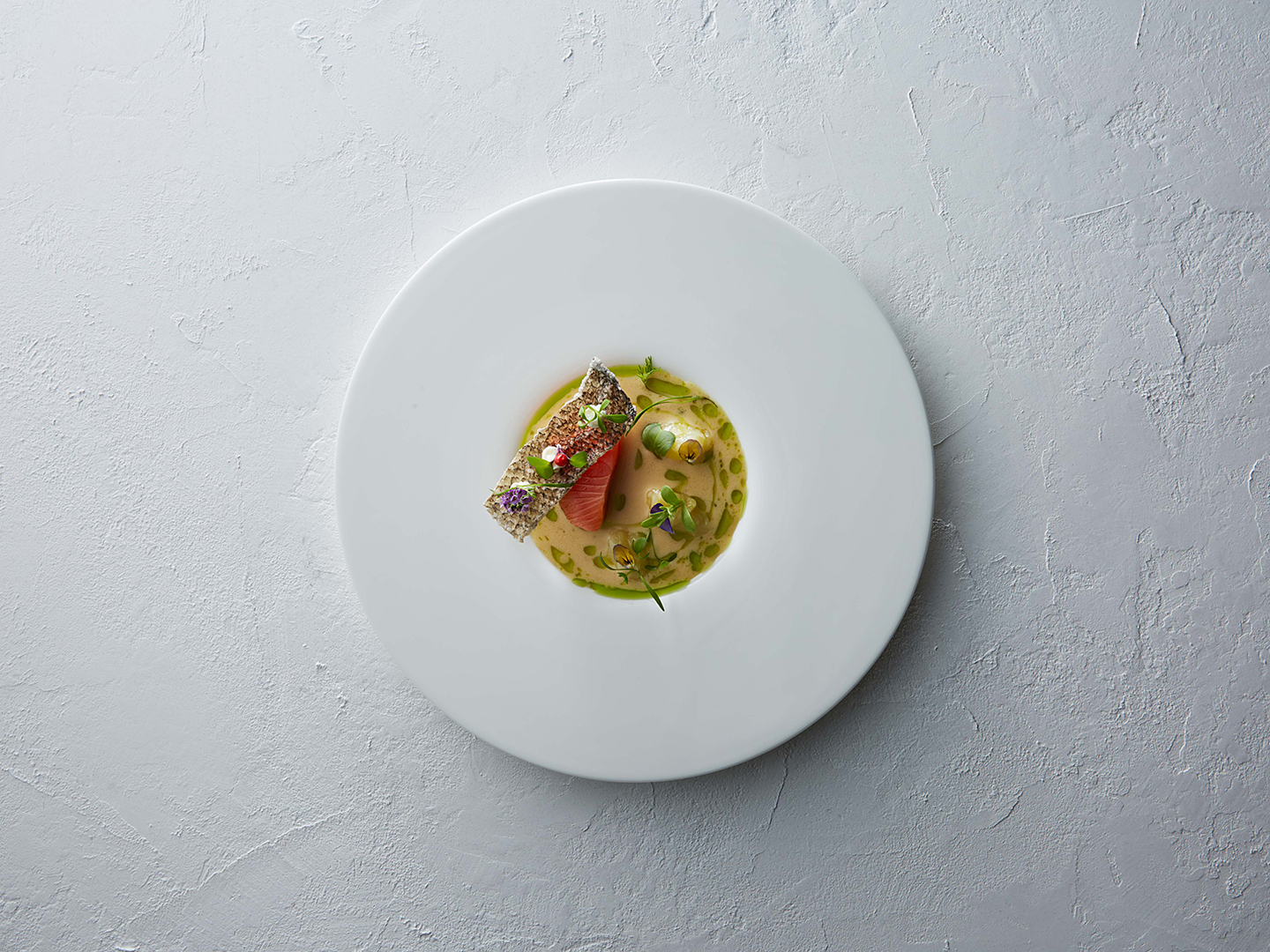
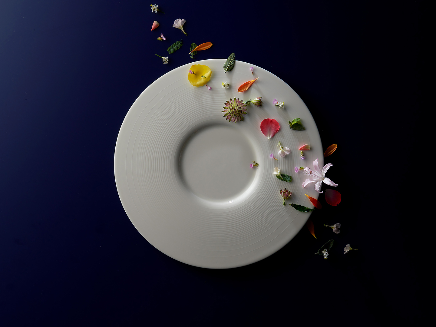
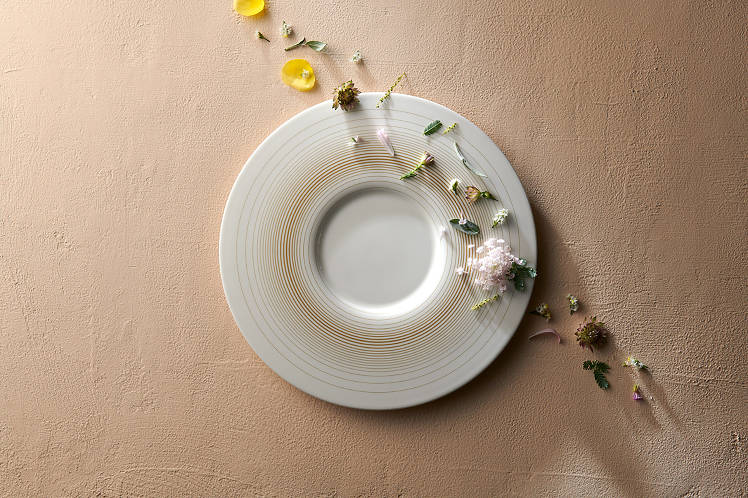
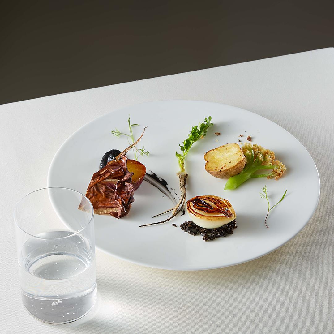
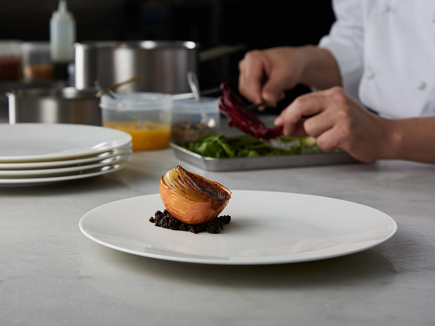
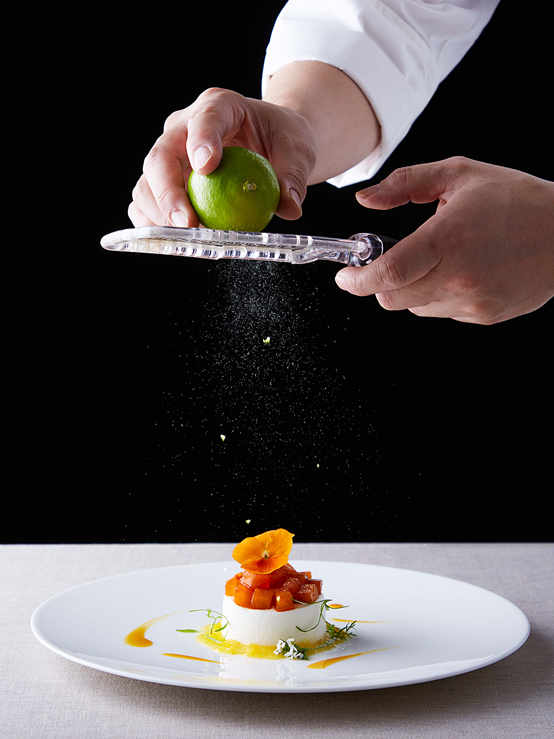
RESONANCE
This collection embodies a neutral design that harmonizes with the table while preserving a sense of calm.
Stripping away historical and cultural ornamentation to its essence, the new coupe shape embraces minimalism. Gentle curve extend outward from the center, creating a flat surface that inspires creativity and opens up new culinary possibilities.
With a broad, open design to accommodate diverse dishes and a delicately tapered rim for an elevated appearance, this series combines sophistication and versatility, perfectly suited for today’s dining styles.
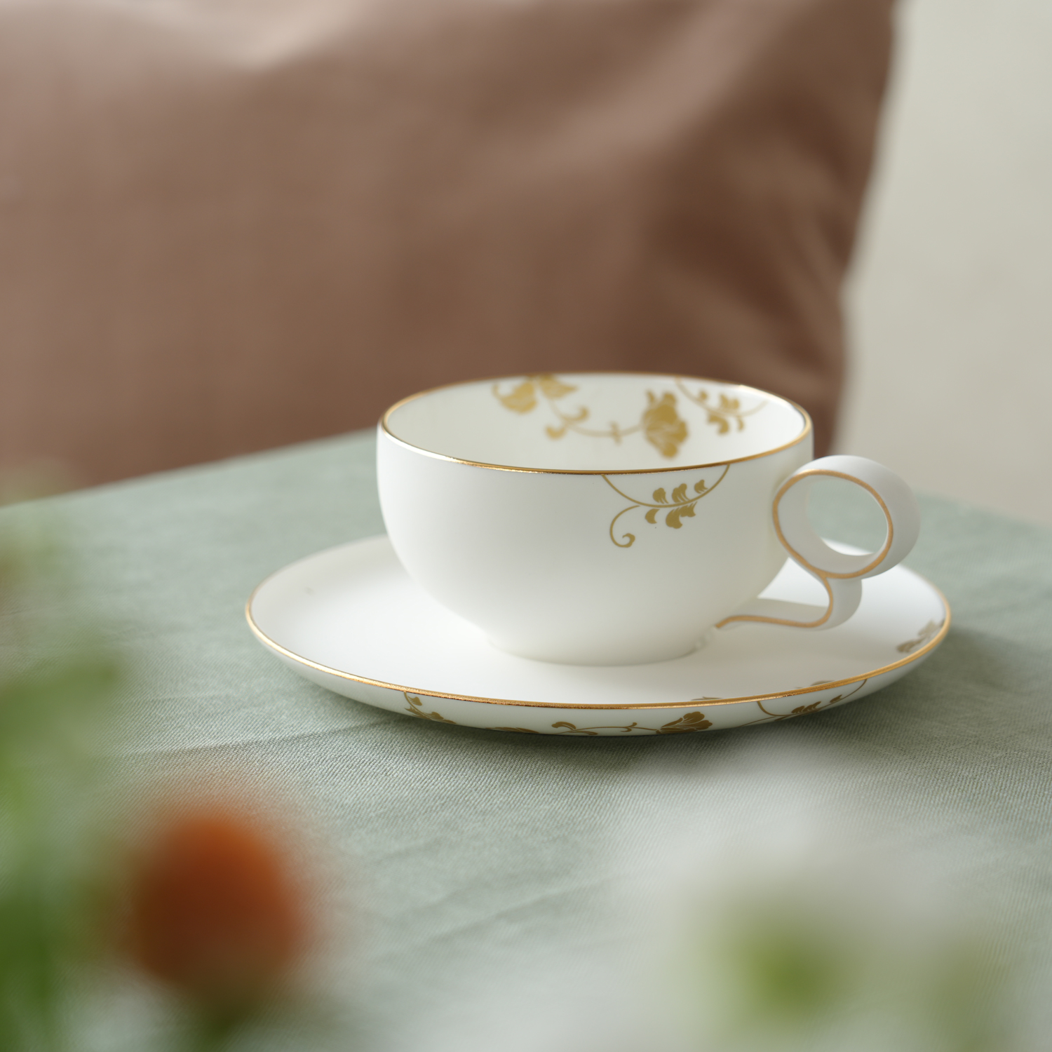
MOMENT -gold decal-
ーーーーーーーーーーーーーーーーーーーーー
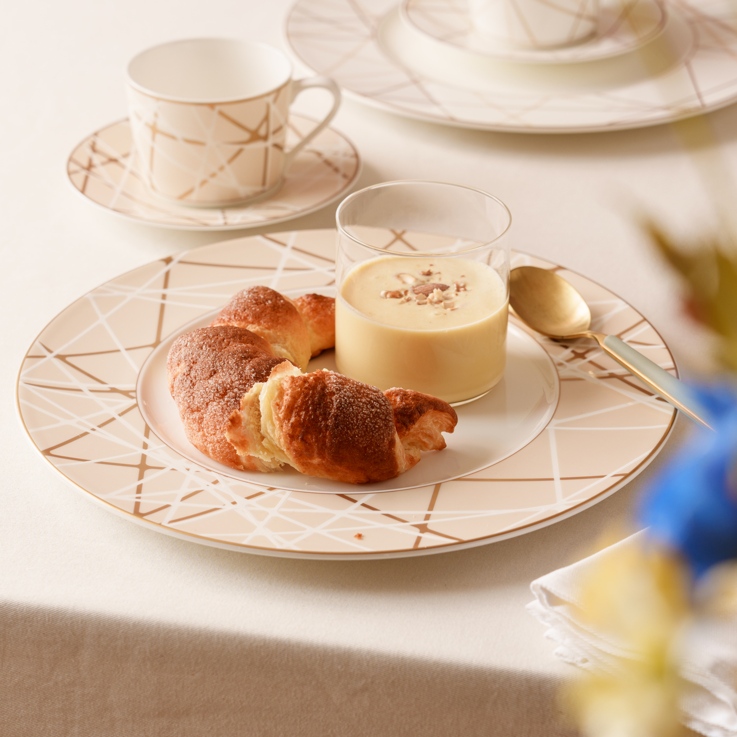
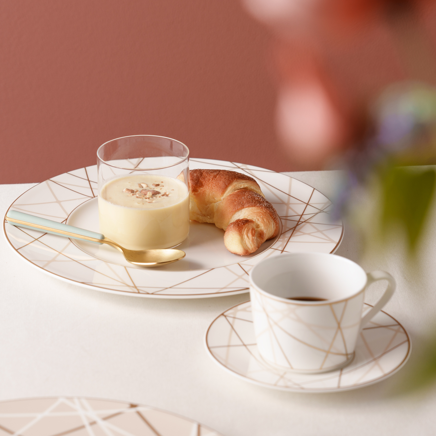
AVENUE
This design draws inspiration from the beauty of urban streetscapes, rendered through contemporary art with straight lines that resemble a city map. It pairs seamlessly with the Boulevard collection, offering flexibility to create a distinctive and stylish table setting.
BOULEVARD
This design captures the essence of contemporary art, inspired by intersecting lines that symbolize life’s trajectory—where diverse cultural backgrounds, values, and sensibilities come together to create something entirely new. With a shared theme and patterns, it pairs perfectly with the Avenue collection for a cohesive yet creative table setting.
Gloria
————————————–
Inquiries about Professional Collections
Please feel free to contact us for further information.